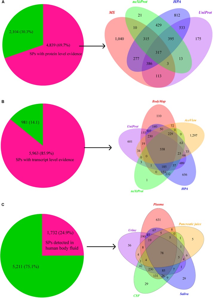
FIGURE 3.
Supporting evidences of SPs at protein and transcript levels. (A) Pie chart shows the number and proportion of SPs that have supporting evidence at protein level, while Venn graph shows the distribution of protein level evidences for SPs in databases of neXtProt (2,461), UniProt (1,503), and HPA (1,935), as well as the MS data (3,464 SPs). (B) Pie chart shows the number and percentage of SPs that have supporting evidence at transcript level, while Venn graph shows the distribution of transcript level evidences for SPs in Human BodyMap project (2,407) and databases of UniProt (2,928), neXtProt (1,503), HPA (3,669), and AceView (2,674). (C) Pie chart shows the number and proportion of SPs that detected in human body fluids, while Venn graph shows the number of SPs detected in plasma (1,532), urine (779), cerebrospinal fluid (654), saliva (392), and pancreatic juice (154).

