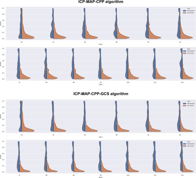
Figure 5.
Violin plot showing the spectrum of predicted risks with time for survivors (orange) and non-survivors (blue). Upper image shows the ICP-MAP-CPP algorithm and the lower image show the ICP-MAP-CPP-GCS algorithm. Each figure goes from the first prediction (24 h) towards the last (120 h). For both algorithms the predicted risk for death increases with time for non-survivors (blue part gets thicker at the top and thinner at the bottom) and the predicted risk for death decreases with time for survivors (orange part gets thicker at the bottom and thinner at the top).

