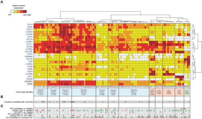
Figure 2.
Phenotypic landscape, variation in cell abundance and association with HIV-infection of myeloid cell clusters from HIV-infected and healthy donor samples. (A) Heatmap showing relative marker expression for myeloid cell clusters. The mean of the median expression of each marker was determined and classified using a five-tiered color scale ranging from white (not expressed) to dark red (highly expressed), according to their relative ranges of expression (5th−95th percentile) throughout the dataset. Clustering markers are shown in blue. Hierarchical clustering of both the cell clusters and clustering markers were performed and represented using dendrograms. Based on the cluster dendrogram, several cluster families were identified and represented in blue for monocyte families, red for cDC families and green for pDC family. (B) Chart summarizing clusters having cell abundance correlated with HIV RNA load (Correlated Clusters). Clusters positively correlated are indicated with a “+,” whereas clusters negatively correlated are indicated with a “–.” (C) Chart summarizing the clusters showing significantly differences of cell abundances between the biological conditions (Differentially Abundant Clusters). For each identified DACs, red arrows indicate an increase of the cell cluster abundance, whereas green arrows indicate a decrease of the cell cluster abundance.

