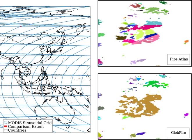
Fig. 6.
The figure on the left shows an area of the world overlapping the 10° × 10° MODIS sinusoidal grid and in red the extent of comparison used in the two images in the right column. The figures in the right column show a zoomed area, applying random colours for each fire event of 2016 to make it easier to distinguish between them. Fire Atlas data of 2016 shows the consequences of using fire event identification at tile level producing an artificial splitting of the fires which follows the pattern of the MODIS tile grid. GlobFire shows the same area of interest for the same year 2016 using GlobFire without any tile pattern.

