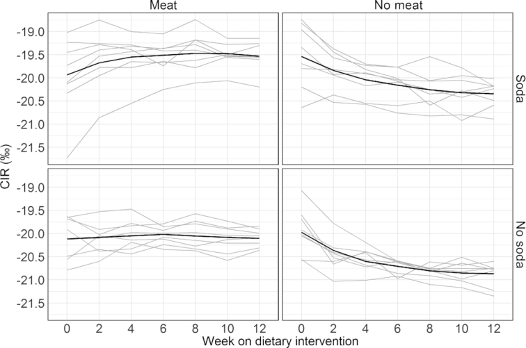
FIGURE 3.

Plasma CIR measurements across all weeks for meat and SSB diet combinations. The gray lines are the individual trajectories within each diet group. The black line is a smoothed average curve within each diet group calculated using the LOESS. Each of the 4 plots displays 8 subjects in each diet combination.
