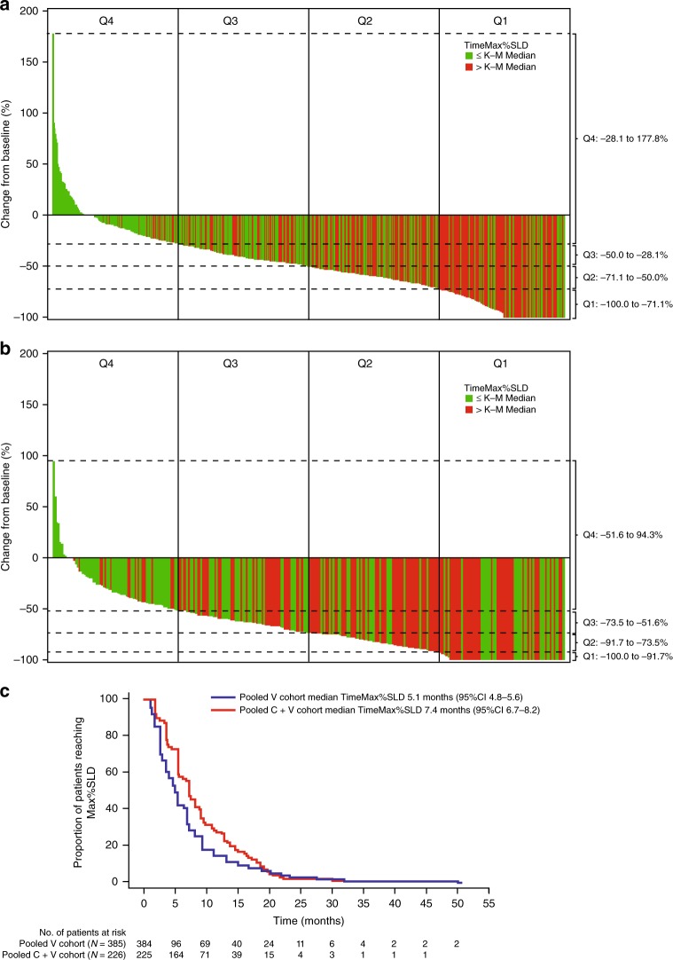
Fig. 1.
Waterfall plots of tumour reduction and time to best response in (a) vemurafenib monotherapy cohort and (b) cobimetinib plus vemurafenib pooled cohort, and (c) Kaplan–Meier median time to best response in patients who had a response to treatment. Bars are colour-coded to indicate whether time to best response is longer (red) or shorter (green) than the median. Dashed lines indicate the tumour reduction ranges for the quartiles used in the analyses. C + V cobimetinib plus vemurafenib, K–M Kaplan–Meier, Max%SLD maximum percentage change in the sum of longest diameters, PD progression of disease, Q quartile, TimeMax%SLD time to maximum percentage change in the sum of longest diameters, V vemurafenib

