. 2019 Nov 11;8:e48063. doi: 10.7554/eLife.48063

Figure 5. Comparison of predictions of the double-adder model with experimental observations.

(A) Binned scatter plot of the added length between birth and division dL versus length at birth Lb shows no correlations in both the data and the simulations, demonstrating that the double-adder model reproduces the adder behavior at the level of cell size. (B) Binned scatter plot of the length at initiation Li versus length at birth Lb shows almost identical correlations in data and simulation. (C) Average (± s.d) cell length at birth Lb. Both the mean and standard deviation are recovered in the model simulation. (D) The distribution of the number of origins at birth is also highly similar between experiments and data for all growth conditions.

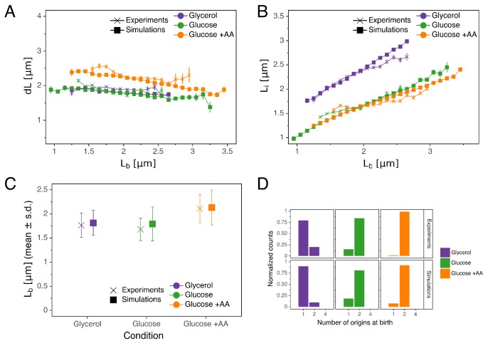
Figure 5—source data 1. Table with source data for Figure 5AB.
Figure 5—source data 2. Table with source data for Figure 5C.
Figure 5—source data 3. Table with source data for Figure 5D.

Figure 5.

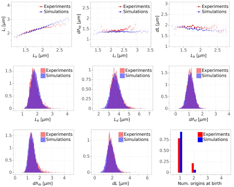
Figure 5—figure supplement 1. Detailed comparisons of cell cycle variables distributions and correlations between experiments and simulations for M9+glycerol condition (with automated origin tracking).

Figure 5—figure supplement 1.

The top row shows binned scatter plots of pairs of variables. The transparency degree reflects the density of data on the horizontal axis. Note that the slight slope of the adder plot (dLvs.Lb) can be corrected when reducing the variances of the division adder distribution (data not shown). As the initiation measurement is made imprecise for experimental (e.g. acquisition rate) and biological (e.g. variable cohesion of origins), it is reasonable to assume that we overestimate the variance of that parameter.
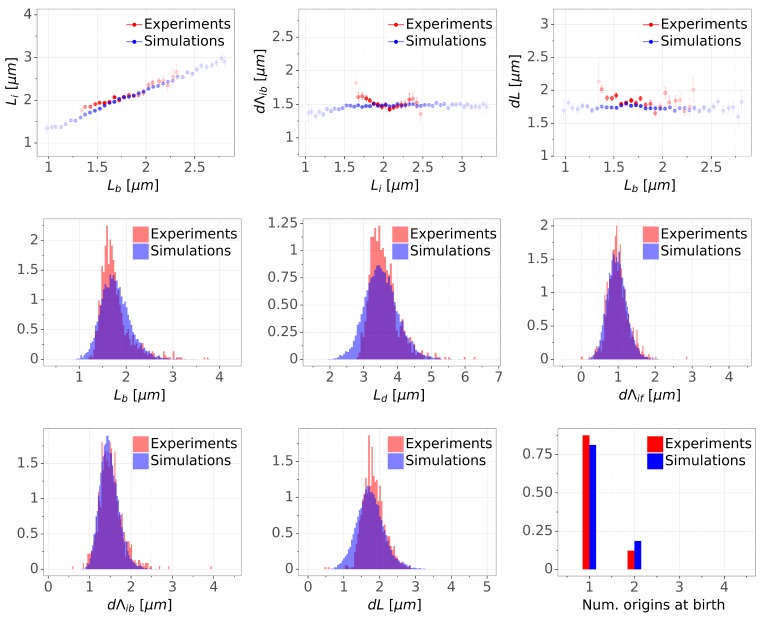
Figure 5—figure supplement 2. Detailed comparisons of cell cycle variables distributions and correlations between experiments and simulations for M9+glycerol condition (with manual origin tracking).

Figure 5—figure supplement 2.

The top row shows binned scatter plots of pairs of variables. The transparency degree reflects the density of data on the horizontal axis.
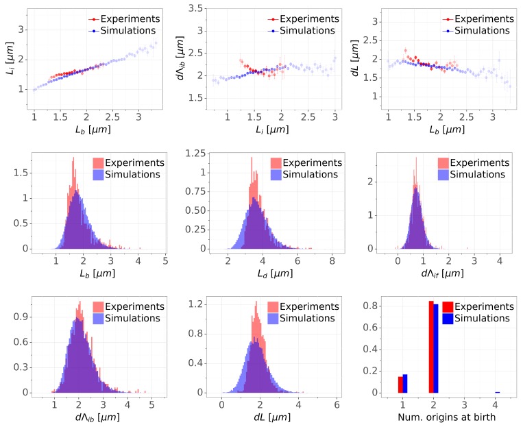
Figure 5—figure supplement 3. Detailed comparisons of cell cycle variables distributions and correlations between experiments and simulations for M9+glucose condition (with manual origin tracking).

Figure 5—figure supplement 3.

The top row shows binned scatter plots of pairs of variables. The transparency degree reflects the density of data on the horizontal axis.
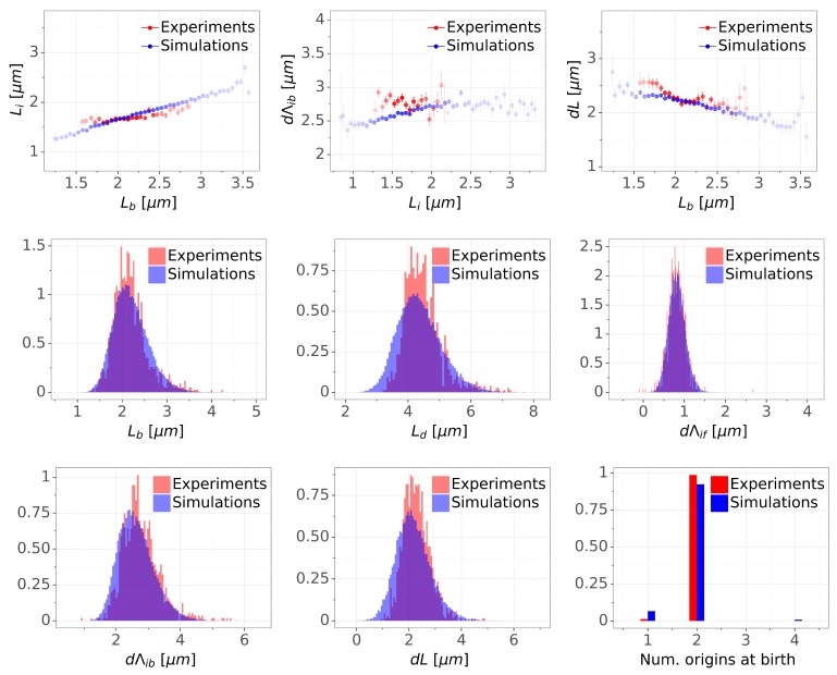
Figure 5—figure supplement 4. Detailed comparisons of cell cycle variables distributions and correlations between experiments and simulations for M9+glucose+8a.a. condition (with manual origin tracking).

Figure 5—figure supplement 4.

The top row shows binned scatter plots of pairs of variables. The transparency degree reflects the density of data on the horizontal axis.