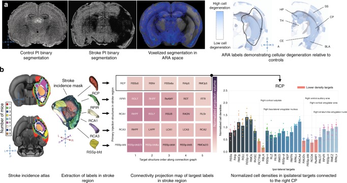
Fig. 4.
Observed cellular degeneration in remote region at the acute stage. a Visualization of cellular degeneration (relative to controls) due to stroke in ARA labels. From left to right: Binary PI segmentation of a control mouse (coronal view) showing similar nuclei counts across both hemispheres. Binary PI segmentation of a stroke mouse showing diminished cellularity in the infarct. The voxelized map (in blue, downsampled and registered to the ARA template in grayscale) also shows diminished cell density per voxel. Right: Two coronal slices of the ARA atlas with label intensity representing decreased cell density normalized to control mice. The dotted line approximately outlines the stroke region with a 50% incidence across the stroke cohort. Lower opacity corresponds to a decrease in cell density. SS: somatosensory areas, CP: caudoputamen, TH: thalamus, HP: hippocampus, CEA: central amygdalar nucleus, BLA: basolateral amygdalar nucleus, S–I: superior–inferior, R–L: right–left. b Investigation of cellular changes in the connected regions. Left: stroke incidence map demonstrating the incidence of an ARA voxel being present in the stroke cohort, with the black dashed line outlining an incidence of >50%. Center left: Rendering of the 50% stroke incidence mask depicting the largest five ARA labels in that mask (RCP: right caudoputamen, RPIR: right piriform area, RCA1: field CA1 of the right hippocampus, RCA3: field CA3 of the right hippocampus, RSSp-bfd: right primary somatosensory area, barrel field). Center right: projection targets of each of the largest five labels in the stroke mask (with each label as an injection sites), ranked by normalized projection volume (color bar). Right: The bar graphs represent PI cell density in our stroke mice normalized to controls. Salmon-colored bars indicate regions with cell densities lower than two standard deviations from the mean of all normalized regions. The strength of connectivity decreases from left to right and with increasing color brightness, with the most connected regions being darker and on the left. Individual data points for each target region are overlaid on its corresponding bar graph. Error bars represent 95% confidence intervals using 1000 bootstrap iterations.

