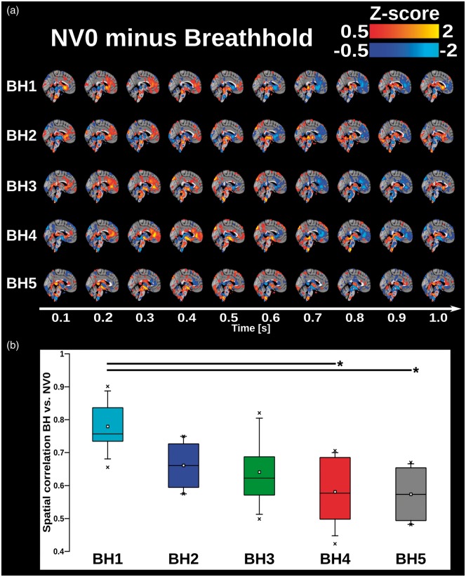
Figure 5.
(a) 3D time lapsed group averaged and phase-matched differential QPP maps of cardiac pulsations of the human brain calculated by subtracting each BH run from NV0. Pulse represented in 1 s time frame with time steps of 0.1 s corresponding MREG TR. Red colors show areas where amplitude of NV0 is greater compared to BH and blue colors show areas where amplitude of BH is greater compared to NV0. (b) 4D spatial correlation of cardiovascular QPP map between BH1–5 and NV0 (colored boxes) On each box, the line and square indicate the median and mean, respectively, and the bottom and top edges of the box indicate the 25th and 75th percentiles, respectively. Whiskers extend to the 5th and 95th percentiles and minimum and maximum values are plotted as ‘x'. Significance bars indicate a significant difference between respective BHs runs, with *:p < 0.01 and **p < 0.001, uncorrected (Supplementary Table 1).

