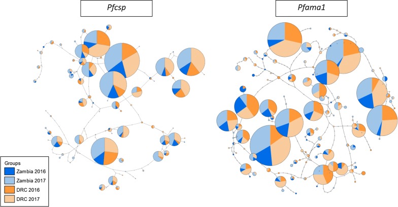
Fig. 3.
TCS haplotype networks for Pfcsp (left) and Pfama1 (right). Each circle represents a unique haplotype; circles are scaled according to the frequency each haplotype was observed and colored by the proportion of sequences per haplotype originating from Zambia (blue) or the DRC (orange). Darker shades indicate that samples were collected in 2016, and lighter shades indicate that samples were collected in 2017. The number of mutations that differ between haplotypes is indicated by the number of notches in the lines connecting circles

