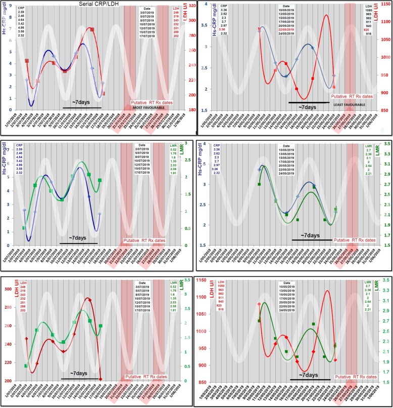
Fig. 2.
Immune oscillation monitoring and treatment profile: This figure describes the graphical representation of serial monitoring data over 2 weeks of two example patients in left and right columns. Each graph panel compares the polynomial cyclical relationship and periodicity of biomarkers Hs-CRP/ LDH, Hs-CRP/LMR and LMR/LDH against a standard sine-wave (thick white line). This white sinusoidal line projects forward in time in attempt to identify the putative “most favourable” or “least favourable” dates to treat (marked as red boxes)

