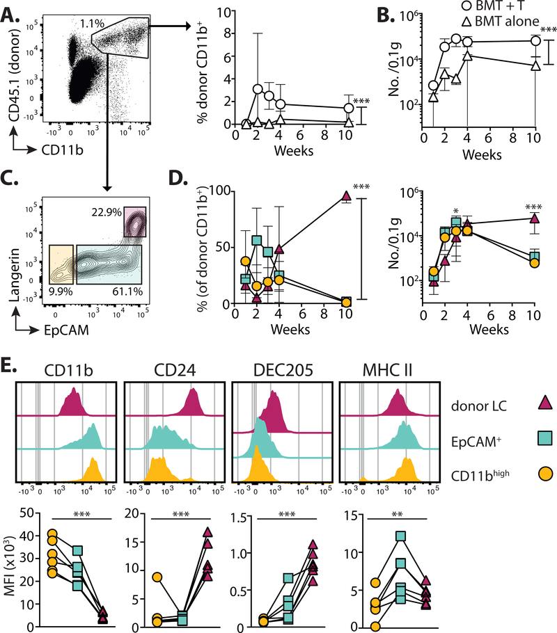
Figure 3. LC repopulation is preceded by influx of CD11b+ cells.
Mice received BMT with T cells, and the epidermis was analyzed at different time points. A. Left - dot plot shows the gating of single CD11bint to highCD45.1+ donor myeloid cells. Right - summary graph showing the frequency ± SD donor CD11b+ cells in mice receiving BMT alone (triangles) or BMT + T cells (circles) (n= 6–7). B. Graph shows the number ± SD per 0.1g total ear weight of donor CD11b+ cells (n=5–10). C. Representative contour plots at 3 weeks showing 3 distinct sub-populations within single CD11bint to highCD45.1+ cells. D. Summary graphs showing the frequency ± SD (left) and number ±SD (right) of cells within each of the gated populations shown in C: Circles CD11bhigh (EpCAMnegLangerinneg); squares EpCAM+; triangles donor LC (EpCAM+Langerin+) (n=7–8). Data are pooled from 2 independent experiments and analyzed by 2-way ANOVA for frequency; significance for numbers was calculated with a 2-way ANOVA with Tukeys multiple comparisons test. E. Top - representative histogram overlays show surface expression levels of LC-defining proteins in the gated donor populations 3 weeks post-transplant. Bottom - graphs show summary data for the median fluorescent intensity (MFI). Symbols represent individual samples, analyzed using a repeated measurements 1-way ANOVA. Data are pooled from 2 independent experiments per time point (n=6). *P<0.05, **P<0.01, ***P<0.001.

