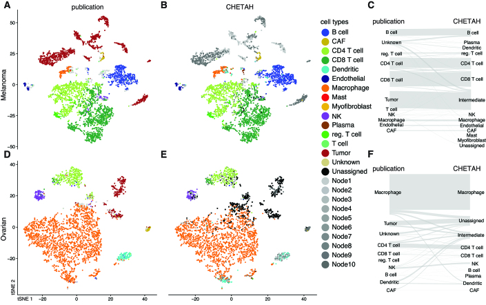
Figure 2.
CHETAH’s classification of two tumor sample datasets is nearly identical to the published manual classification. The t-SNE plots depict each cell as a dot, with the colors representing the inferred cell type shown in the legend. Gray colors indicate intermediate cell types which are labeled automatically as Node1, Node2, etc. For the corresponding classification trees see Supplementary Figure S2. Rows of panels: datasets classified (A-C: Melanoma, Tirosh et al. (24); D-F: Ovarian, Schelker et al. (18)); columns: classification method. For an overview of the datasets see Table 1.

