
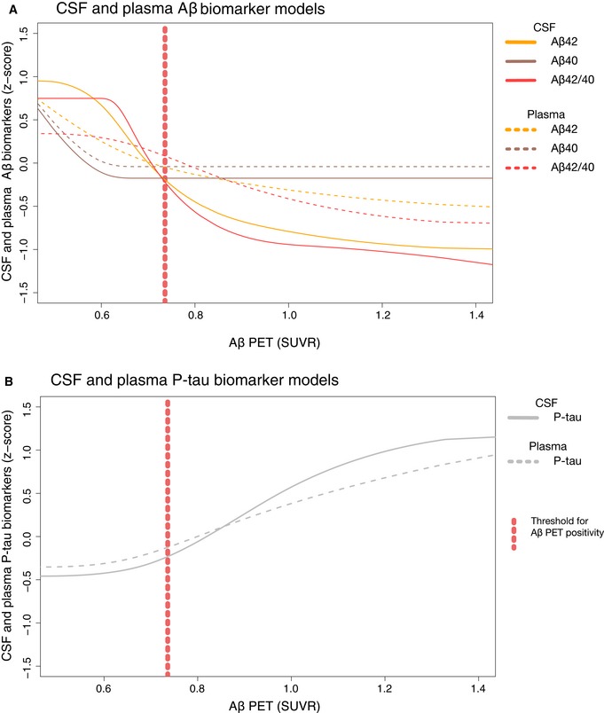
Figure 3. Comparison of selected CSF and plasma biomarker models.
-
ASame models as in Fig 1A and B for CSF and plasma Aβ40, Aβ42, and Aβ42/40, but now in the same panel for easier comparison.
- B
Official websites use .gov
A
.gov website belongs to an official
government organization in the United States.
Secure .gov websites use HTTPS
A lock (
) or https:// means you've safely
connected to the .gov website. Share sensitive
information only on official, secure websites.