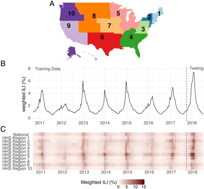
Fig 1. Overview of region-level influenza surveillance data in the US.
(A) Map of the 10 U.S. Health and Human Services regions. Influenza forecasts are made at this geographic scale. (B) Publicly available wILI data from the CDC website for the national level. The y-axis shows the estimated percentage of doctor’s office visits in which a patient presents with influenza-like illness for each week from September 2010 through July 2018. The dashed vertical line indicates the separation of the data used by the models presented here for the training (retrospective) and testing (prospective) phases of analysis. (C) Publicly available wILI data for National level and each of the 10 HHS regions. Darker colors indicate higher wILI.

