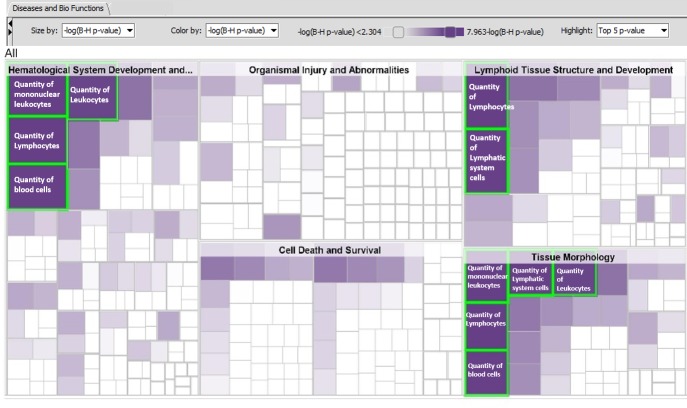
Fig 7. Hierarchical heatmap with diseases and bio-function category and top 5 high level functions are displayed and labeled inside the highlighted green border.
The visualization is a TreeMap (hierarchical heatmap) where the major boxes represent a family (or category) of related functions. Each individual colored rectangle is a particular biological function or disease and the color indicates associated log of the calculated BH corrected p-value: lower p value (purple), or higher p value (white). Darker colors indicate lower p values. In this default view, larger squares indicate more significant overlap between the genes perturbed in the dataset and the function or disease. The image has been cropped for better readability. Here data from whole blood when frozen vs. cold conditions are compared using top 1000 FDR corrected DEGs was used.

