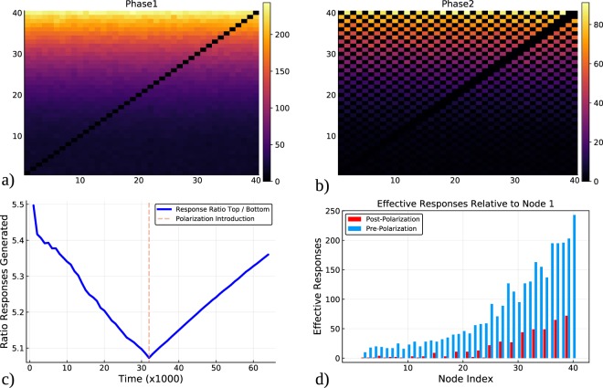
Figure 1.
How influence scores change before and after polarization. Plot (a) shows the accumulated counts of the successful responses between nodes sending messages without polarization, and plot (b) shows the same information during the phase of polarized communication (evens and odds have a disagreement). Each cell represents the number successful messages sent by user i to user j. Plot (c) shows the value of the relative influence of the top half of the nodes in respect to the bottom half during the simulation in which a polarization event is introduced at the dashed vertical line. Plot (d) shows the total amount of successful messages sent by each user to the lowest ranked influencer (before and after the introduction of polarization).

