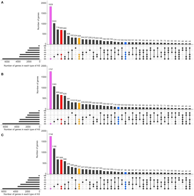
Figure 2.
The distributions of ASEs and ASRGs in each kind of RCC. The Upset plot shows the distribution of ASRGs and ASEs in the pan-RCC. The bar chart above represents the number of genes contained in each type of group. The bar chart at the bottom left represents the number of events included in each type of AS events. The dotted line at the bottom right shows the types of events contained in the group. Pink indicates the group with the largest number of ASRGs in the groups containing one event type. Red indicates the group with the largest number of ASRGs in the groups containing two event types. Yellow indicates the group with the largest number of ASRGs in the groups containing three event types. Blue indicates the group with the largest number of ASRGs in the groups containing four event types. (A) KIRC; (B) KICH; and (C) KIRP.

