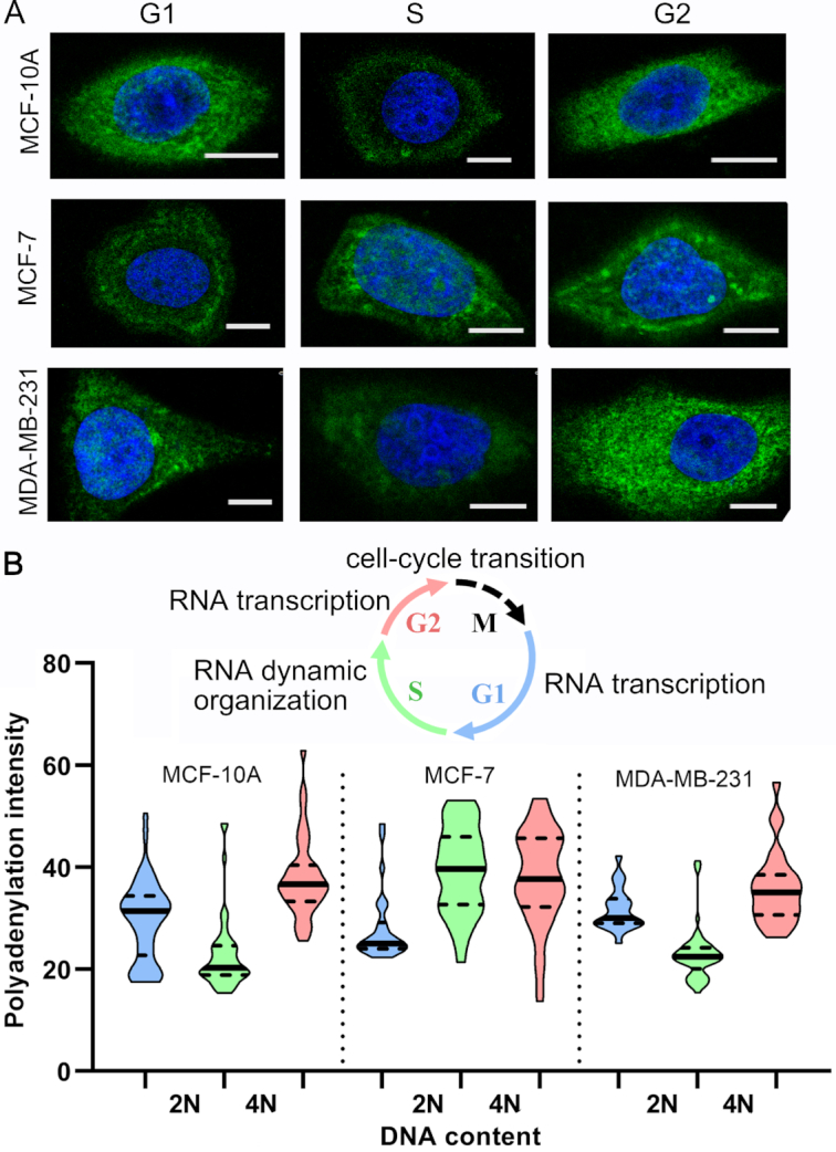
Figure 5.

Cell cycle-specific RNA polyadenylation. (A) Representative cell images (green, polyadenylation fluorescence; blue, DAPI; scale bar, 10 μm). (B) The violin plot (G1, blue; S, green; G2, pink) depicting RNA polyadenylation intensity distribution. The cell numbers are 43, 49, 39, 30, 33, 50, 27, 57 and 28, respectively (from left to right). The inset diagram indicates RNA features during cell cycle transitions. M represents the Mitosis phase.
