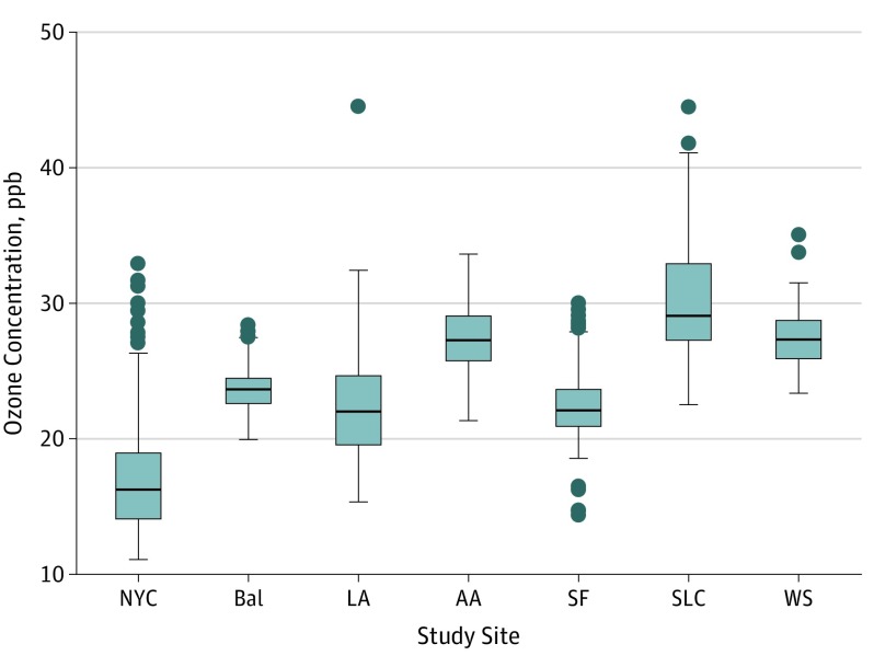
Figure 1. Distribution of 10-Year Historical Ozone Concentration by Study Site .
The boxes indicate the interquartile range (IQR); the lower hinge (bottom of box), the 25th percentile value; the center line, the median concentration; and the upper hinge (top of box), the 75th percentile value. The upper whisker represents the maximum observation that falls within the upper limit (75th percentile + 1.5 × IQR); the lower whisker, the minimum observation that falls within the lower limit (25th percentile − 1.5 × IQR). The circles represent outlier values.
AA indicates Ann Arbor, Michigan; Bal, Baltimore, Maryland; LA, Los Angeles, California; NYC, New York City, New York; ppb, parts per billion; SF, San Francisco, California; SLC, Salt Lake City, Utah; WS, Winston-Salem, North Carolina.

