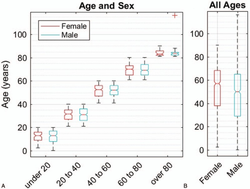
FIGURE 1.

Age and sex boxplot. A, Presenting ages of the 1905 patients in cohorts of 20 years. The boxes indicate 25th, 50th, and 75th percentile of the age distributions. The red + represents a 116-year-old male outlier. B. The overall distribution of ages. A bootstrap analysis showed that the 10th, 25th, 50th, and 75th percentiles for female were all significantly older than for male (Text).
