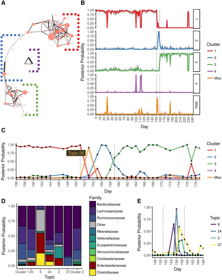
Fig 5. Application of the topic model approach to David et al. [23] data.
(A). The topic-to-topic correlation graph showing two topic clusters (clusters 1 and 3) connected by a linear chain of topics (cluster 2) that follow the time progression of the taxonomic change due to the food poisoning infection. (B). Distribution of topic assignments as a function of day and cluster (panels), indicating 3 distinct profiles. The interval in which food poisoning symptoms presented (per David et al. [23]) are marked with dotted vertical lines. Gray shading indicated 80% uncertainty intervals. (C). Frequency of cluster assignments as a function of day, indicated day 153 marking the shift from profiles 1 to 2 and day 159 marking the shift from profiles 2 to 3. (D). Frequency of taxa assignments given a cluster assignment. Cluster 2 is shown in terms of its topics (9, 24, 2, 37). Topic 20 is also shown (misc. cluster), which lacked any edges in the correlation graph, but marks the initial appearance of Enterobacteriaceae on day 153 (representing the start of the infection). (E). The probability of the topic assignments given each day for cluster 2. The progression of topics also follows the progression of taxonomic change shown in the correlation graph.

