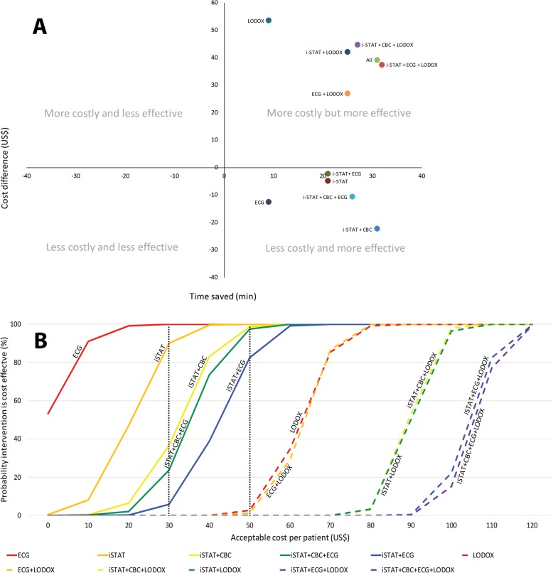
Fig. 2.
a Cost Effectiveness Plane. Permutations in the south-east quadrant were less costly and more effective (also referred to as dominant) [13]. Permutations in the north-east quadrant were still more effective but were also costlier. b Cost-Effectiveness Acceptability Curve. Cost-effectiveness acceptability curves for each of the permutations. The proportion of the bootstrap datapoints achieving cost-effectiveness at each increment of potentially acceptable cost is shown. Permutations which included LODOX® are shown with dashed lines. The dotted lines represent two potential willingness-to-pay thresholds. For example, at US$50, virtually all the non-LODOX® permutations have a high probability of being cost-effective. On the other hand, at a willingness-to-pay threshold of US$30, only the iSTAT and the ECG permutations have a high probability of being cost-effective. This graph allows the funder to weigh the relative cost of each of the permutations against their known effectiveness. CBC Complete Blood Count, ECG electrocardiogram, i-STAT i-STAT POC tests, LODOX® Low-dose x-ray

