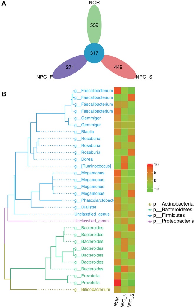
Figure 3.

Comparison of OTUs and phylogenetic tree map, (A) petal diagram based on OTUs of the healthy controls (NOR), familial NPC patients (NPC_F) and sporadic NPC patients (NPC_S) group. (B) Phylogenetic tree map, the phylogenetic tree on the left consists of nodes and branches, the different color of the branches represents the classification at different phylum levels, each terminal node represents an OTU, the corresponding classification of the OTU at the genus level is showed at the end of the branch. The heat map on the right clusters the standardized abundance of the genus corresponding to the left, through value-color gradient, the redder the color, the larger the value, the richer the abundance (phylum to genus: p, phylum; g, genus). Abundance standardization: the absolute abundance of each sample minus the mean absolute abundance of the genus and divided by the standard deviation; the normalized mean abundance is 0 and the standard deviation is 1.
