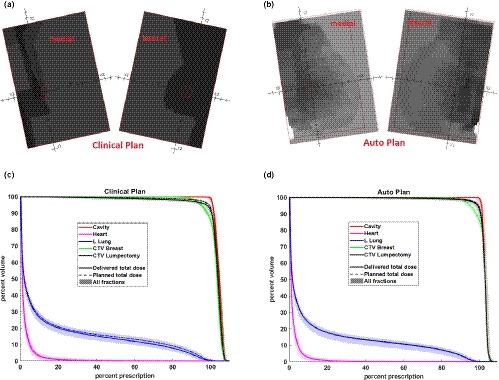
Figure 5.

Comparison of beam fluence pattern (top figures) and delivered dose volume histogram (DVH) (bottom figures) with the measured patient motion for case #1 between the clinical (left figures) and auto (right figures) plans. In the DVH figures, the dashed lines represent the planned DVH, the shaded regions represent delivered DVHs with the measured patient motion for each treatment fraction, and the solid lines represent the total delivered DVH of all fractions.
