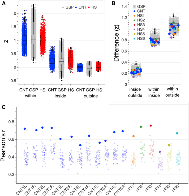
Figure 3. Connectivity Control Analyses.
(A) Homogeneity of vertex to parcel time series responses within the originally assigned parcel (within), to all parcels inside the parcel’s network (inside), and to all parcels outside the network (outside) for the GSP (gray), CNT (blue) and HS (red) participants. Strengths of correlation (Z) for each comparison in HS were within the normal range of the CNT sample (see Table S1 for statistics). Each data point represents the average correlation for all vertices that comprise a given parcel (200 data points per subject/hemisphere). Boxplots represent distribution of the GSP data.
(B) Differences in strength of correlations between homogeneity comparisons (inside versus outside network, within parcel versus inside network, and within parcel versus outside network) were positive for all HS and control participants. Data points represent individual differences between averaged homogeneity comparisons per hemisphere. Boxplots represent distribution of the GSP data.
(C) Functional connectome fingerprinting per hemisphere. All but one hemisphere in each of the CNT and HS samples (CNT4L and HS5) showed successful connectome fingerprinting; i.e., the functional connectome was most similar across two runs of the same participant (large dots) than in comparison with any other participant (small dots). Boxplots represent distribution of the GSP data. CNT, Caltech control group; GSP, Brain Genomics Superstruct control group; HS, hemispherectomy; L, left hemisphere; R, right hemisphere; Z, Fisher’s r to z transformed strength of correlation coefficient.

