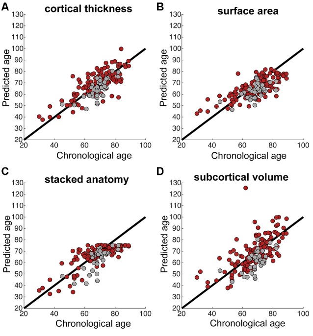
Figure 1.

(A–D) Correlations between chronological and predicted age for each of the brain measures. Black line shows the perfect correlation, red circles represent stroke participants, gray circles represent control participants. Note the tendency for underestimated predicted age in control participants in most measures (gray circles below the black line).
