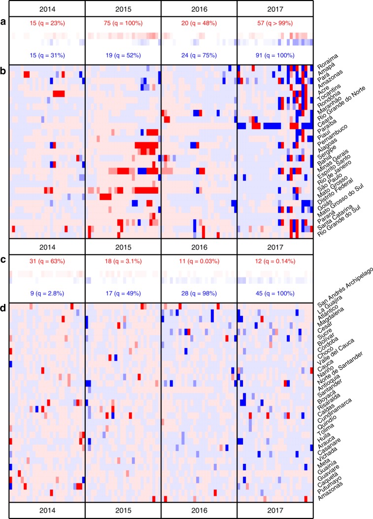
Fig. 2. Comparison between predicted and observed dengue incidence.
Results for 2014–2017 are shown for Brazil (a, b) and Colombia (c, d) (see Supplementary Fig. 5 and 6 for full time series). b, d Red or blue indicate that the observed incidence fell above or below the median of 500 draws from the posterior of predicted values for that biweek. Medium or dark shading indicates that the observed incidence fell outside of the 90 or 95% prediction interval (PI) for that biweek. a, c The number of biweeks with observations falling below (blue) or above (red) the 90% PI are displayed with a quantile of the observed number of significant biweeks out of a distribution generated by 10,000 bootstrapped replicates. In these replicates, year labels were randomly re-assigned for each location before counting the biweeks in each year that were above or below the 90% PI (see “Methods” for further details).

