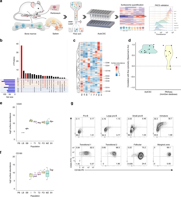
Fig. 2. De novo mapping of developing mouse B cell populations using autoCSC.
a Schematic illustration of the workflow used to phenotype B cell populations and identify subpopulations. b Quantified surface protein distribution of developing B cell populations visualised by upset plot. The bar chart on top visualises the number of proteins contained within each intersection as defined in the lower part. c Heatmap of z-score abundance values. Surface proteins used for subsequent flow cytometry analysis are indicated to the right. d Correlation analysis (spearman’s rho) comparing autoCSC and RNA-seq with flow cytometry. e, f Box-plots showing autoCSC obtained surface abundance values for (e) CD20 and (f) CD180 in B cell populations. The center line of box-plots represents the median, box limits the upper and lower quartiles, whiskers the 1.5x interquartile range and dots any outlier data points. g Flow cytometry distributions of CD20 and CD180 surface abundances during B cell development.

