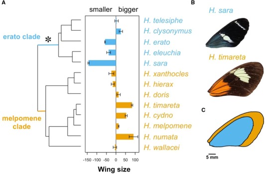
Figure 3.

Male wing area differences across the phylogeny. (A) Bar plot represents centered mean wing area per species (positive values represent species with bigger wings than the average Heliconius wing). Wing area, x‐axis, is the difference in wing area from the mean (in mm2). Error bars represent standard errors. The star represents the origin of pupal‐mating. Species from the erato clade are in blue, and those from the melpomene clade are in orange. (B) Representatives of H. timareta and H. sara closest to the mean wing area of the species are shown (606.25 and 386.6 mm2, respectively). (C) Images from (B) superimposed to compare visually the mean size difference between the two species. [Color figure can be viewed at http://wileyonlinelibrary.com]
