
Figure 4.
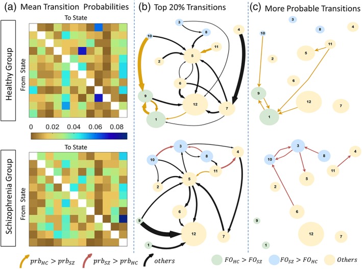
Transition probabilities between brain states for schizophrenia and healthy comparison groups. (a) Group‐averaged transition probability matrices for schizophrenia (lower) and healthy comparison groups (upper). Diagonal matrix elements omitted to aid visualization. (b) Top 20% of the transitions (c) State transitions that have significantly different probability of occurrence (p < 0.05), identified by network‐based statistic. Each circle represents a state. Circle diameter is modulated by the fractional occupancy time of the corresponding state. Circle colors denote states with significantly increased fractional occupancy in the healthy comparison (green) and schizophrenia (blue) groups. Yellow circles denote states with no significant between‐group difference in fractional occupancy. Each arrow represents a transition. Arrows denote transitions with significantly greater probability in healthy comparison (dark yellow) and schizophrenia (maroon)) groups. Arrow thicknesses in panel b correspond to group‐averaged probability of that transition. The 20% strongest transitions should not be interpreted as significant, but are rather visualized in panel b to highlight those transitions which are more probable on average. FO, fractional occupancy; Prb, probability. The 12 states are as follows: 1 = Hi, 2 = SalHi‐ExHi, 3 = DMLo‐SenHi, 4 = DMHi, 5 = DMLo, 6 = SenMean, 7 = SalLo‐ExHi, 8 = SenHi‐ExLo, 9 = DMHi‐SenLo, 10 = Lo, 11 = DMHi‐SalLo, 12 = Mean [Color figure can be viewed at http://wileyonlinelibrary.com]