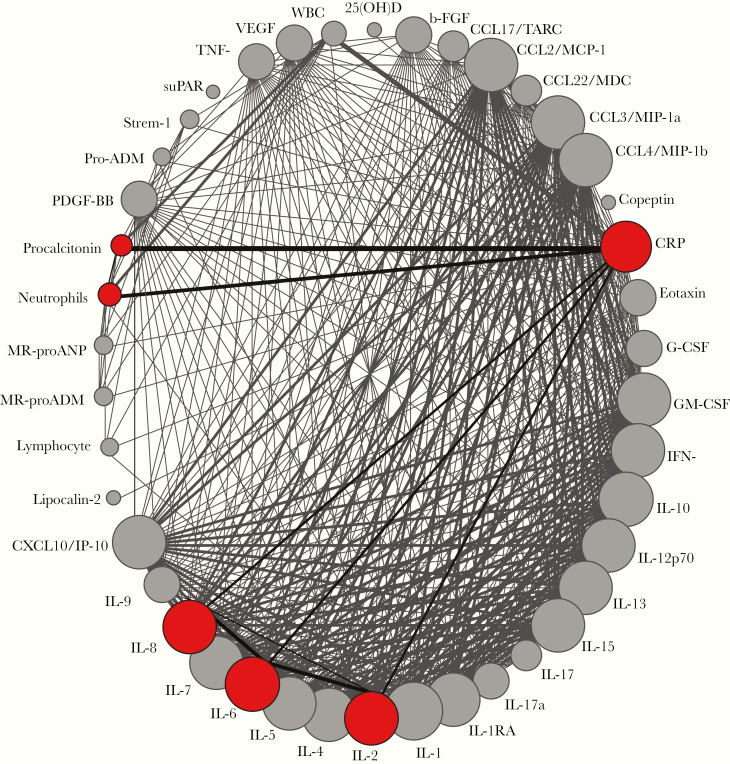
Figure 3.
Network analysis of the frequency of articles reporting each biomarker in the context of severe CAP. Each biomarker reported in the studies evaluated is shown as a circle. Colored circles highlight biomarkers that were significantly associated with severe CAP. The circle size is proportional to the number of patients who presented with severe CAP and had this marker measured (see n1 values). Lines connecting the circles highlight biomarkers that were studied together. The width of the lines is proportional to the number of studies reporting each pair of biomarkers.

