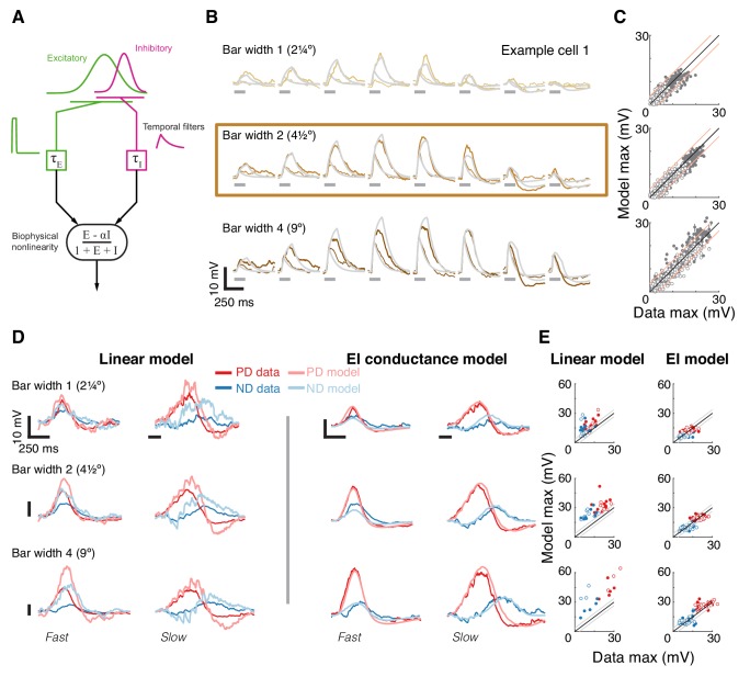
Figure 4. A conductance-based model quantitatively predicts directionally selective responses.
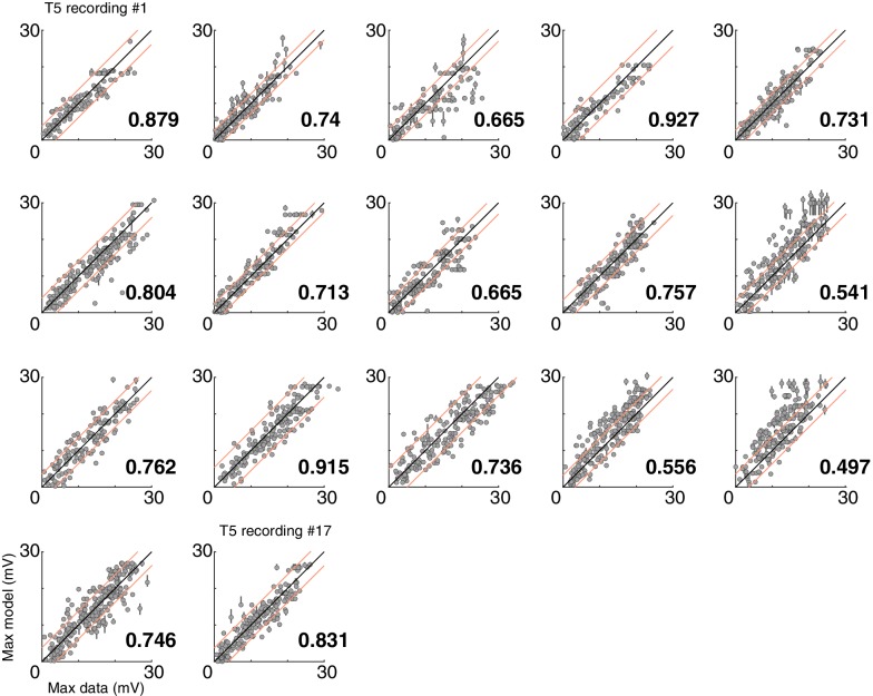
(A) T5 EI model schematic with fast spatially symmetric excitation and slow, trailing-side asymmetric inhibition. (B) Mean measured responses to single bar flashes of 3 widths and two flash durations at eight different positions (in colors) compared to predicted model responses (gray) from an example cell (same as Figure 1). Model parameters were optimized to each cell using only responses from bars of width 2 (brown frame). (C) Peak measured response compared to the peak of the predicted response for all bar flash stimuli from all cells and positions (empty marker denotes short duration flash, filled denotes long flashes). Each dot represents the mean peak response (for top 10 of 1000 optimization solutions for each cell, estimated by fit error), while vertical lines (most obscured by markers) represent maximal and minimal values of the peak responses. Diagonal lines surrounding the unity line denote + /- the upper quartile of the Mean Absolute Deviation (MAD) of responses to repeated presentation of the same stimuli (see Materials and methods). (D) Mean measured responses to moving bars of three widths and two speeds overlaid with predicted responses from linear (superposition of flash responses) and EI conductance model for same example cell and the same model parameters as in (B). Note scale change on voltage axis of linear predictions due to overestimation. (E) Peak measured responses compared to peak predicted responses from both linear and EI models for all moving bars (grouped by bar width). Plotting conventions as in C; except PD in red, ND in blue. Note consistent overestimation of linear model, which is exacerbated for larger stimuli. See also Figure 4—figure supplement 1 for distributions of individual cell measurement and EI model prediction responses.


