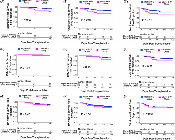
Figure 4.

Survival curves based on a bottom quartile cutoff of the relative gut abundance of BPG bacteria. Survival curves show days post transplant on the x‐axis and virus survival free proportion on the y‐axis. The blue line represents the cohort of the Higher BPG Bacteria Group and the magenta line represents the cohort of the Lower BPG Bacteria Group. The number at risk is shown in the table below the survival curve. The P value was calculated using a log‐rank test. Panel A. Survival curve for respiratory virus survival free proportion at 6 mo post transplantation. Panel B. Survival curve for respiratory virus survival free proportion at 1 y post transplantation. Panel C. Survival curve for respiratory virus survival free proportion at 2 y post transplantation. Panel D. Survival curve for CMV viremia survival free proportion at 6 mo post transplantation. Panel E. Survival curve for CMV viremia survival free proportion at 1 y post transplantation. Panel F. Survival curve for CMV viremia survival free proportion at 2 y post transplantation. Panel G. Survival curve for BK viremia survival free proportion at 6 mo post transplantation. Panel H. Survival curve for BK viremia survival free proportion at 1 y post transplantation. Panel I. Survival curve for BK viremia survival free proportion at 2 y post transplantation
