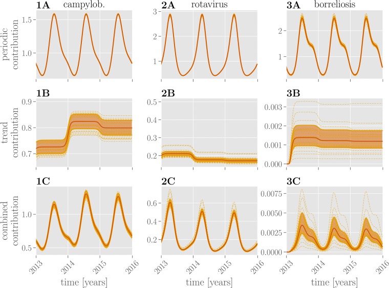
Fig 4. Learned temporal contributions.
Periodic contributions over the course of three years (2013-2016) for all three diseases are shown in the row A, trend contributions in the row B and their combination in the row C. Red lines show the mean exponentiated linear combination of periodic or trend or both features through the respective parameters. Dashed lines show random samples thereof; the shaded region marks the 25%-75% quantile.

