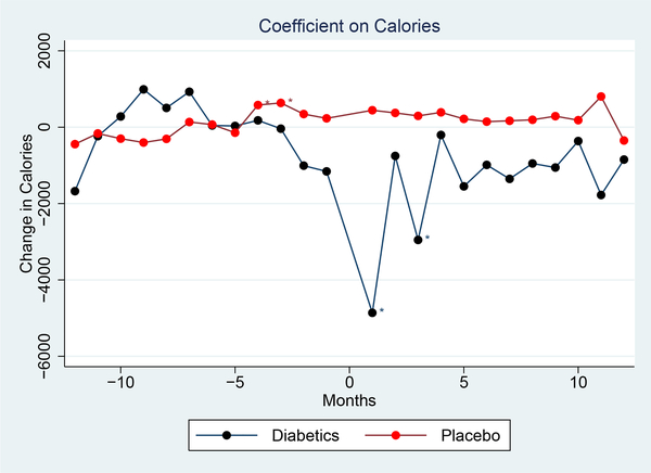
Figure 2: Impact of Diagnosis on Calories.
Notes: This graph shows changes in calories after the inferred diagnosis. The graph shows coefficients from a regression of calories on time from diagnosis with household and year-month fixed effects; the coefficients are relative to the mean in the pre-period. The red line shows the trend over time for a placebo group of household without diagnosis. “Diagnosis” timing is defined randomly for this set. The outcome is calories per household member.

