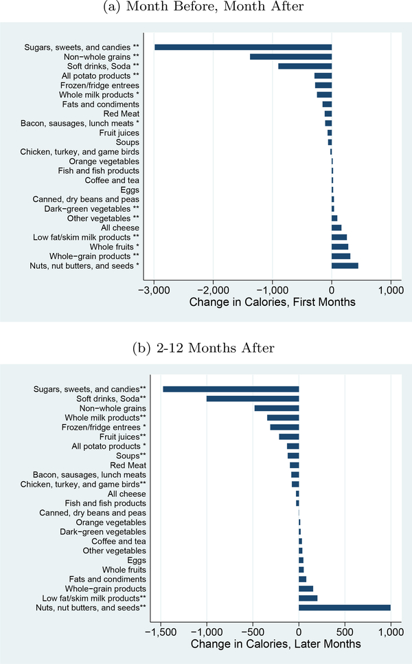
Figure 3: Changes by Food Group, Calories.
Notes: This graph shows the impact on calories by food group, using the USDA Thrifty Food Plan (TFP) groups. Results are generated by regressing the calories in each group on dummies for time from diagnosis (first months, later months, with year prior as the excluded category), year-month fixed effects and household fixed effects. ∗indicates significance at 5% level;∗∗ indicates significance at the 1% level.

