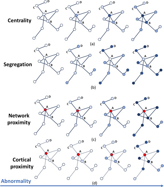
Figure 4. Temporal progression patterns (left-to-right) of different descriptors.

For each descriptor (row), abnormality increases in a descriptor-specific pattern. The magnitude of cumulative abnormality at a node is proportional to the color intensity. Red nodes are epicenters. (a) Centrality: node A is affected first due to having the highest centrality, followed by node B, then C and D. (b) Segregation: node D is affected first due to having the highest segregation, followed by C, then B and A. (c) Network proximity: nodes B and C are affected before D, because they are closer to the epicenter A (along the connectivity network). (d) Cortical proximity: node B is affected first because of its spatial proximity to the epicenter A, then C and finally D. Here edges are dashed as no information is needed from connectivity.
