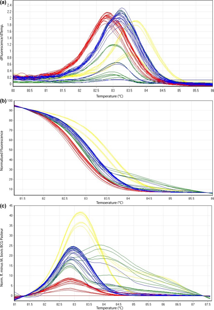
Figure 4.

Representative high‐resolution melting graphs corresponding to one high‐resolution melting analysis of a subset of clinical specimens (n = 18) for HRM assay 2. Curves of tested samples previously identified as M. tuberculosis are shown in yellow, M. microti in blue, M. bovis/M. bovis BCG in red, and M. caprae in green. (a) Melting curves; (b) normalized plot; and (c) difference plot in relation to M. bovis BCG Pasteur ATCC 35734
