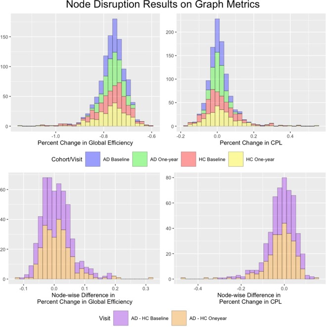
Figure 7.
Global Efficiency and CPL results for the node disruption analysis. The top row plots histograms of the percent change in each metric after removing each node. The bottom row displays histograms of the node-specific difference between the percent change the the AD cohort and the percent change in the HC cohort across all nodes. Because all percent changes in GE were negative upon removal of a node, a positive value of this difference indicates that global efficiency was more affected in HC when that particular node was disconnected. Similarly, a negative value indicates that GE was more disrupted in AD network compared to the HC network when this node was disconnected. negative values for the difference in percent change in CPL between the AD and HC network upon disconnection of a node indicates that CPL increased more in the HC network.

