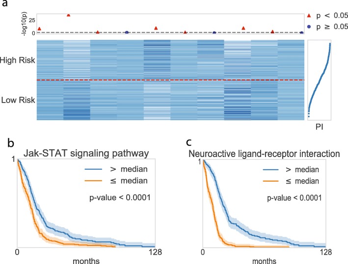
Fig. 3.
Graphical visualization of the node values in the pathway layer. a Heatmap of the top ten pathway nodes. The horizontal dashed line in red distinguishes two risk groups, where the upper/lower partition belongs to high risk/low risk patients. The top dot plot indicates the nodes’ significance. A logrank test was conducted for each node within two risk groups in the scale of -log10(p-values), where red indicates statistical significance, and blue shows insignificance. The plot in the right panel displays the prognostic index (PI) with each corresponding sample. b–c Kaplan-Meier plots for the top two pathway nodes

