. 2019 Dec;21(2):309–323.

Figure 2.

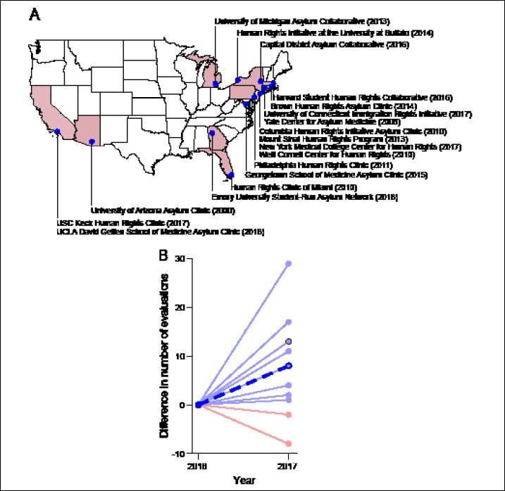
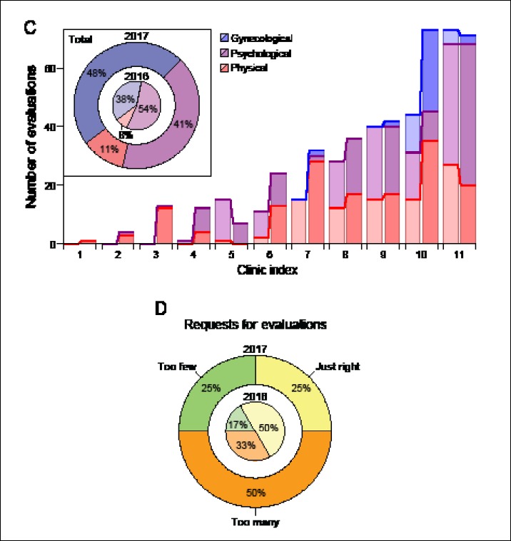
(a) Map showing the 18 active organizations that received the survey in 2018. The founding year of each clinic is listed in parentheses. Because they had not yet performed a forensic evaluation by the end of 2018, the student-run organizations at the Albert Einstein College of Medicine, CUNY School of Medicine/Sophie Davis, Geisel School of Medicine at Dartmouth, Touro College of Osteopathic Medicine, NYIT College of Osteopathic Medicine, and UTMB at Galveston are not shown. (b) Differences in the numbers of evaluations performed between 2017 and 2016. Data is shown only for the eleven clinics from which complete training data were obtained for both surveys. Light-blue lines indicate an increase in the number of evaluations, whereas light-red lines indicate a decrease. The thick, blue, and dashed line represents the average difference across clinics. A black circle indicates that the same difference was obtained for two clinics. (c) Bar chart depicting the numbers of each type of evaluation (physical, psychological, and gynecological) performed by each clinic. Light shades of each color correspond to data from 2016, and darker shades portray data from 2017. The inset displays the proportions of evaluation types among all evaluations performed in 2016 (inner circle) and in 2017 (outer circle). (d) Pie chart showing the proportion of clinics that reported receiving a number of evaluation requests that exceeded the organization’s capacity (“too many”), receiving a number of evaluation requests that was commensurate with the organization’s capacity (“just right”), or having capacity that exceeded the number of received evaluation requests (“too few”). Data are shown for 2016 (inner circle) and for 2017 (outer circle).

(a) Map showing the 18 active organizations that received the survey in 2018. The founding year of each clinic is listed in parentheses. Because they had not yet performed a forensic evaluation by the end of 2018, the student-run organizations at the Albert Einstein College of Medicine, CUNY School of Medicine/Sophie Davis, Geisel School of Medicine at Dartmouth, Touro College of Osteopathic Medicine, NYIT College of Osteopathic Medicine, and UTMB at Galveston are not shown. (b) Differences in the numbers of evaluations performed between 2017 and 2016. Data is shown only for the eleven clinics from which complete training data were obtained for both surveys. Light-blue lines indicate an increase in the number of evaluations, whereas light-red lines indicate a decrease. The thick, blue, and dashed line represents the average difference across clinics. A black circle indicates that the same difference was obtained for two clinics. (c) Bar chart depicting the numbers of each type of evaluation (physical, psychological, and gynecological) performed by each clinic. Light shades of each color correspond to data from 2016, and darker shades portray data from 2017. The inset displays the proportions of evaluation types among all evaluations performed in 2016 (inner circle) and in 2017 (outer circle). (d) Pie chart showing the proportion of clinics that reported receiving a number of evaluation requests that exceeded the organization’s capacity (“too many”), receiving a number of evaluation requests that was commensurate with the organization’s capacity (“just right”), or having capacity that exceeded the number of received evaluation requests (“too few”). Data are shown for 2016 (inner circle) and for 2017 (outer circle).

Caseloads for student-run asylum clinics