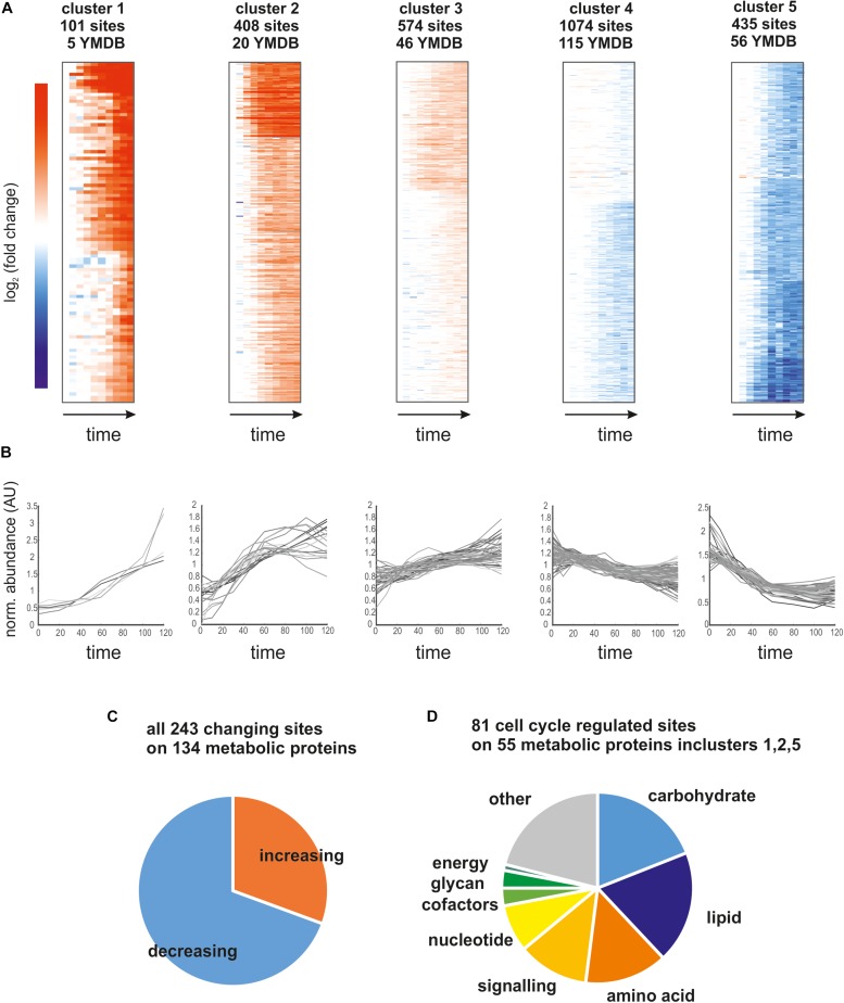
FIGURE 3.
(A) Heatmaps of the five identified clusters based on log2 (fold change) relative to t = 0 min. We report the number of sites contributing to the cluster and how many of those map to proteins in the yeast metabolome database (YMDB). (B) Time course of phosphosite abundance for all sites on a YMDB protein in the corresponding cluster. (C) Pie chart reporting the fraction of phosphosites on YMDB metabolic proteins whose abundance is increasing or decreasing through the cell cycle. (D) Pie chart reporting the pathway assignments of the phosphorylation sites whose abundance changes the most through the cell cycle.

