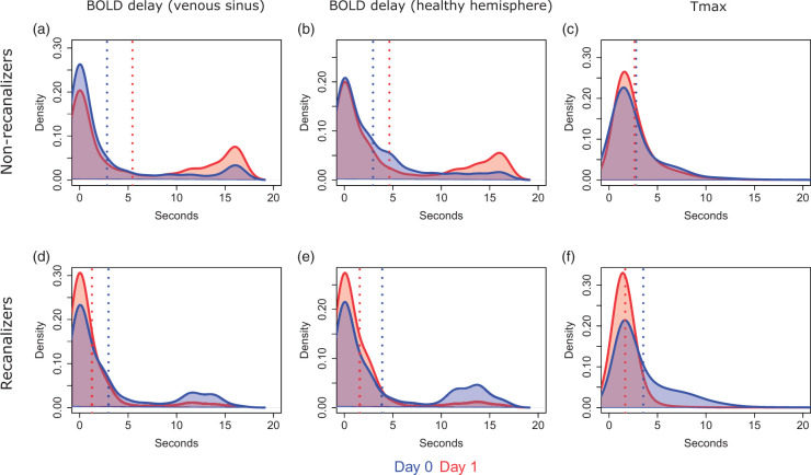
Figure 5.
Kernel density plots showing the distribution of perfusion deficit severity values (pooled across all patients who received both DSC-MRI and rsfMRI scans) on day 0 and day 1 in the affected vascular territory according to recanalization status. Blue and red vertical lines indicate the mean perfusion deficit severity in the sample on days 0 and 1, respectively.

