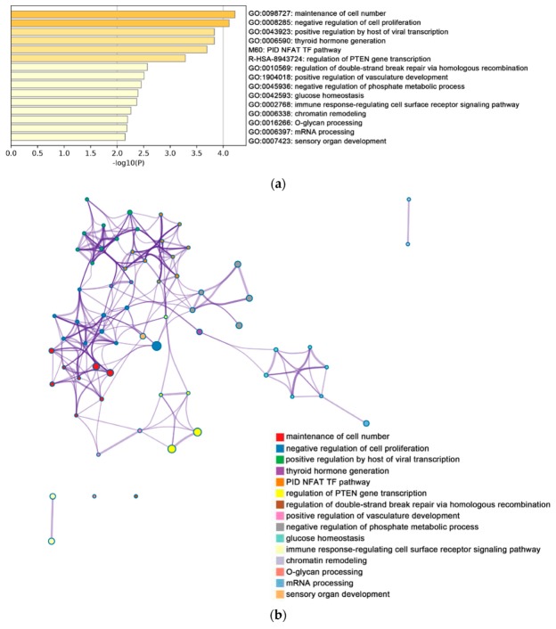
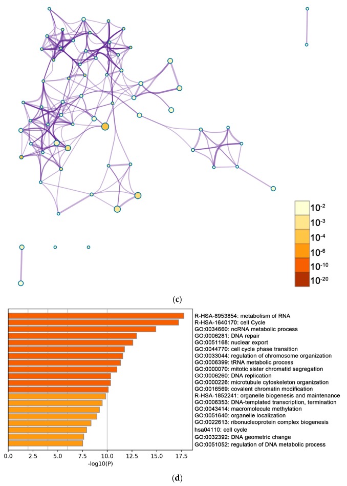
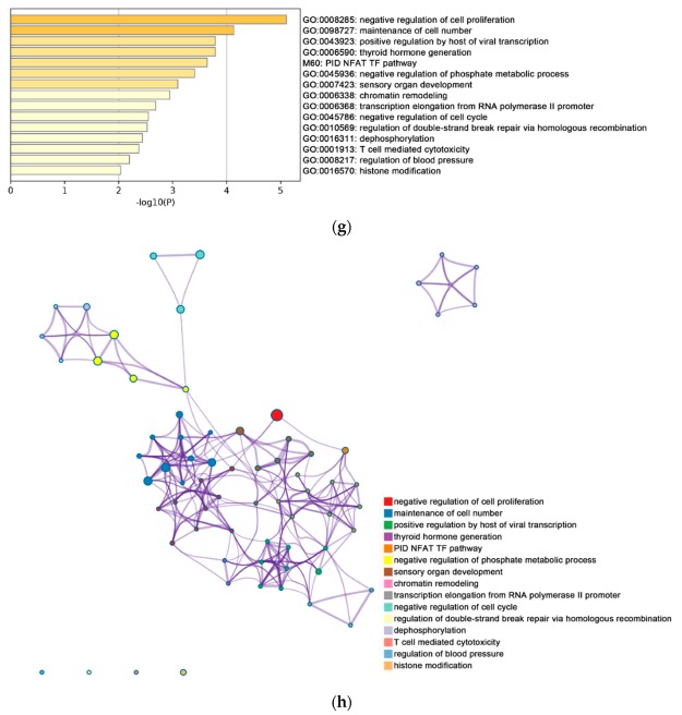
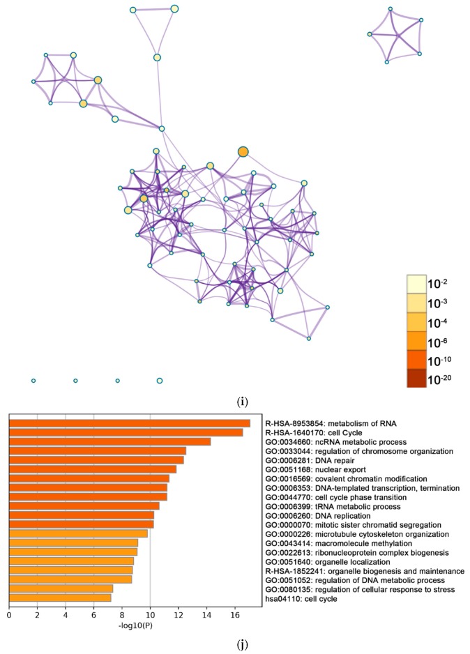
Figure 3.
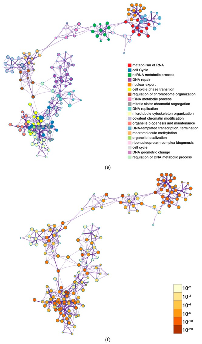
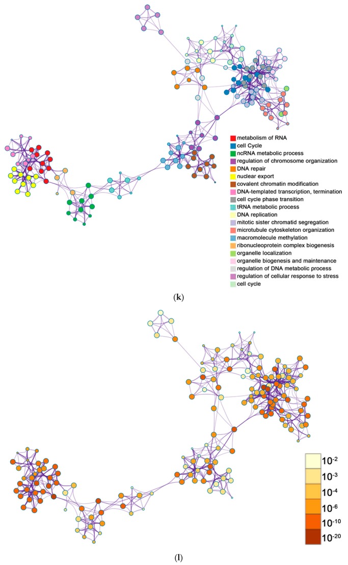
The enrichment analysis was performed by Metascape. (a) Bar graph demonstrating biological processes enrichment analysis of up-regulated genes of group 1. For down-regulated genes of group 1, Metascape only visualized the top 15 clusters by their colors. Enriched terms were identified according to the Kappa similarity >0.3. Each node represents an enriched term, and the nodes are colored by their cluster IDs (b) and p-values (c) separately. The down-regulated genes of group 1 are illustrated in the same way, as (d) shows the bar graph of biological processes enrichment analysis. The top 20 clusters are colored by their cluster IDs, while the p-values are displayed in (e,f) separately. For up-regulated genes of group 2, (g) shows the bar graph of biological processes enrichment analysis. The top 15 clusters are colored by their cluster IDs and p-values, which are displayed in (h,i), respectively. For down-regulated genes of group 2, (j) gives the bar graph of biological processes enrichment analysis. The top 20 clusters are colored by their cluster IDs and their p-values are illustrated in (k,l), respectively. All graphs were generated by Metascape (http://metascape.org/gp/index.html#/main/step1).

