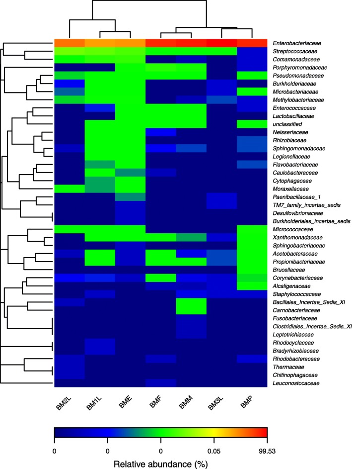
Fig 3.
Heat map showing bacterial family frequency distribution across the seven different life stages. The heat map plot depicts the relative percentage of each bacterial family (variables clustering on the Y-axis) within each sample (X-axis clustering). The relative values for bacterial family are depicted by color intensity with the legend indicated at the bottom of the figure. Clusters based on the distance of the seven samples along the X-axis and the bacterial families along the Y-axis are indicated in the upper and left of the figure, respectively

