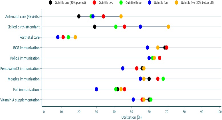
Fig. 2.
Percent utilization of maternal, neonatal, and child health services in each wealth quintiles Note: Colored dots show the mean coverage in each wealth quintile. Q1 represents the20% poorest wealth quintile and Q5 the 20% better-off. The distance between quintiles 1 and 5 represents absolute inequity. The horizontal lines connect the better-off (gold) and poorest (black) quintiles. The longer the line between the two groups, the greater the absolute inequity

