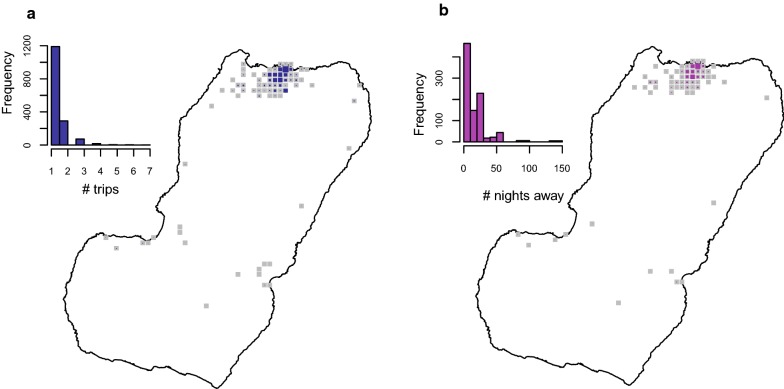
Fig. 4.
Frequency of travel and time at risk spent in mainland Equatorial Guinea. a Travel rate to mainland EG, or number of trips made within the 8 weeks preceding the MIS. The inset histogram illustrates the frequency distribution and the map shows the travel rate by area of residence expressed as the mean weighted by sample size. The grey boxes correspond to km areas with data available and the blue boxes are proportional in size to the weighted mean of the travel rate. b Cumulative time spent in mainland EG by area of residence. The grey boxes are km areas for which this information is available and the size of the purple squares is proportional to the maximum median man-nights spent abroad (60 nights). The distribution of nights away from home during trips to mainland is illustrated in the inset histogram

