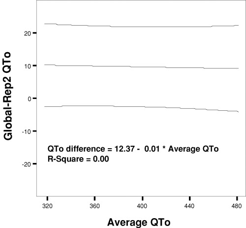
Figure 3.

Bland–Altman plot illustrating the relation of the differences between global QTo and representative lead II QTo (baseline method) to underlying QTo value expressed as the average of the two measurements. Data are shown with the mean regression line and 95% boundary. Despite the systematically higher values for global QT, there is no relation of the differences to the underlying QT measurements (R2= 0.00).
