
Figure 1.
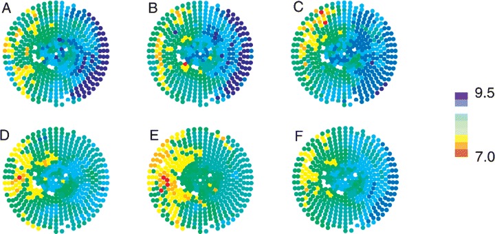
DF distribution during a VF episode. Panels A–E show maps of the mean DF at each electrode for 5–10, 10–15, 15–20, 20–25, and 25–30 seconds, respectively. Panel F shows the mean DF at each electrode over the entire 25 second VF episode. The right of each map denotes the LV and the left denotes the RV. The apex of the heart is central, surrounded by the base. LAD is at top. The color scale on the right denotes mean DF in Hertz. The white sites denote bad electrodes that were not included in the analysis (used with the publisher's permission from Newton et al. 47 ).